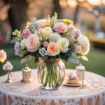
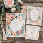
Wedding Invitation Fonts – As an entrepreneur in the wedding industry, you know how important it is to create beautiful and memorable invitations for your clients. Wedding invitations are not only a way to communicate the details of the event, but also a way to express the personality, style, and theme of the couple.
One of the key elements of wedding invitation design is the font. Wedding Invitation Fonts are the visual representation of the text, and it can have a significant impact on the overall look and feel of the invitation. The font can also convey different emotions, moods, and messages to the guests.
However, choosing the right font for wedding invitations can be a daunting task, especially if you have to deal with different types of clients and events. You have to consider factors such as readability, compatibility, suitability, and uniqueness. You also have to optimize your font for print and digital formats, as well as for search engines, so that potential clients can find your services online.
To help you with this task, we have compiled some tips on how to choose the best Wedding Invitation Fonts for your clients’ invitations. You can use these tips as guidelines or suggestions for your own font selection. You can also customize them according to your clients’ preferences and needs.
Readability of Wedding Invitation Fonts
The first and foremost factor to consider when choosing a font for wedding invitations is readability. Readability is the ease with which the text can be read and understood by the guests. Readability depends on several aspects of the font, such as size, style, weight, spacing, contrast, and alignment.
To ensure readability, you should follow these tips:
– Choose a font size that is large enough to be legible, but not too large to overwhelm the design. A general rule of thumb is to use a font size of 12 points or larger for the main text, and 10 points or larger for the secondary text.
– Choose a font style that matches the tone and formality of the event. For example, you can use a serif font (such as Times New Roman or Georgia) for a formal or traditional wedding, or a sans serif font (such as Arial or Helvetica) for a casual or modern wedding.
– Choose a font weight that creates a balance between the text and the background. For example, you can use a bold or heavy font for a dark or busy background, or a light or thin font for a light or simple background.
– Choose a font spacing that allows enough room for the text to breathe, but not too much to create gaps or disconnects. For example, you can use a tight or condensed spacing for a long or dense text, or a loose or expanded spacing for a short or sparse text.
– Choose a font contrast that creates a distinction between the different types of text, such as headings, subheadings, body text, and names. For example, you can use different fonts, sizes, styles, weights, colors, or effects (such as italics or capitals) to highlight the most important information.
– Choose a font alignment that creates a harmony and order among the text elements. For example, you can use a left or right alignment for a linear or symmetrical layout, or a center or justified alignment for a circular or asymmetrical layout.
Compatibility of Wedding Invitation Fonts
The second factor to consider when choosing a font for wedding invitations is compatibility. Compatibility is the degree to which the font matches with other elements of the design, such as colors, images, graphics, shapes, and patterns. Compatibility also depends on the format and medium of the invitation, such as print or digital.
To ensure compatibility, you should follow these tips:
– Choose a font color that complements or contrasts with the background color. For example, you can use a warm or bright color (such as red or yellow) for a cool or dark background (such as blue or black), or a cool or muted color (such as green or gray) for a warm or light background (such as pink or white).
– Choose a font image that supports or enhances the theme of the event. For example, you can use an image of flowers or hearts for a romantic or floral theme, or an image of stars or fireworks for a festive or glamorous theme.
– Choose a font graphic that adds interest or flair to the design. For example, you can use a graphic of swirls or flourishes for an elegant or vintage theme, or a graphic of dots or stripes for a fun or playful theme.
– Choose a font shape that fits with the shape of the invitation. For example, you can use a round or oval shape for a round or oval invitation, or a square or rectangular shape for a square or rectangular invitation.
– Choose a font pattern that creates a texture or depth to the design. For example, you can use a pattern of lace or damask for a sophisticated or classic theme, or a pattern of chevron or polka dots for a trendy or modern theme.
– Choose a font format that works well with the format of the invitation. For example, you can use a vector or scalable font for a print invitation, or a bitmap or pixelated font for a digital invitation.
– Choose a font medium that works well with the medium of the invitation. For example, you can use a paper or cardstock font for a paper or cardstock invitation, or an email or web font for an email or web invitation.
Suitability of Wedding Invitation Fonts
The third factor to consider when choosing a font for wedding invitations is suitability. Suitability is the extent to which the font reflects the personality, style, and taste of the couple. Suitability also depends on the preferences and expectations of the guests, as well as the cultural and social norms of the event.
To ensure suitability, you should follow these tips:
– Choose a font that represents the couple’s identity and individuality. For example, you can use a font that reflects their hobbies, interests, passions, or values.
– Choose a font that showcases the couple’s style and taste. For example, you can use a font that matches their fashion sense, home decor, or personal brand.
– Choose a font that appeals to the guests’ preferences and expectations. For example, you can use a font that suits their age group, gender, education level, or profession.
– Choose a font that respects the cultural and social norms of the event. For example, you can use a font that follows the etiquette, traditions, customs, or languages of the event.
Uniqueness
The fourth and final factor to consider when choosing a font for wedding invitations is uniqueness. Uniqueness is the quality of being original, distinctive, and memorable. Uniqueness can help your clients’ invitations stand out from the crowd and make a lasting impression on their guests.
To ensure uniqueness, you should follow these tips:
– Choose a font that is rare, uncommon, or exclusive. For example, you can use a font that is custom-made, hand-drawn, or vintage.
– Choose a font that is creative, innovative, or experimental. For example, you can use a font that is artistic, futuristic, or whimsical.
– Choose a font that is personal, meaningful, or sentimental. For example, you can use a font that is inspired by the couple’s story, relationship, or memories.
Wedding invitation fonts are an essential part of wedding invitation design. By following these tips on how to choose the best fonts for your clients’ invitations, you can create stunning and effective invitations that will impress your clients and their guests.